Non-Traditional Wedding Color Palettes
Weddings are no longer confined to soft ivory, blush, and champagne. Modern couples are rewriting the script — and color is where the magic begins.
Here’s how to break tradition on purpose and design a wedding with unforgettable chromatic energy.
💎Jewel-Tone Enchantment
Think emerald, ruby, sapphire, garnet — rich, bold, regal energy.

Why it works:
- Looks expensive (even when it isn’t)
- Photographs beautifully
- Works for fall, winter, and evening weddings
Pair it with:
- Gold accents
- Velvet table runners
- Candlelit centerpieces
- Invite designs with metallic foil or watercolor gradients
Perfect for couples who want:
Royal romance with mystique.
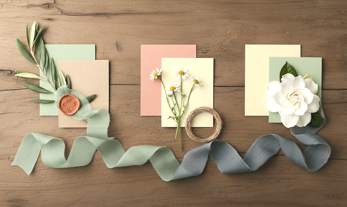
🌸Pastel Surrealism
Pastels don’t have to feel childish — when done right, they look surreal, dreamy and editorial.
Colors to explore:
- Ballet lavender
- Peach sorbet
- Mint cream
- Sky rose
Make it whimsical with:
- Iridescent stationery
- Ombre florals
- Smokey pastel calligraphy
- Irregular-format invitations
Why it’s trending:
It gives “soft luxury meets cotton candy fantasy.”

🧨Fiery Monochrome
One color. Unlimited drama.

Ideas:
- Red full-spectrum wedding: ruby, scarlet, cranberry
- Bold cobalt weddings
- Different shades of orange (sunset tones)
Details that elevate:
- Single-flower bouquets
- Linear candle arrangements
- Layered linens of varying shades
This palette says:
“We’re not quiet. We’re not subtle.”
🍃Earth-Toned Minimalism
Organic elegance > matchy-matchy aesthetics.
Play with:
- Terracotta
- Ochre gold
- Olive moss
- Clay blush
Why this works:
Soft, timeless, and naturally photogenic.
Signature decor moments:
- Handmade ceramic vases
- Linen napkins in earthy shades
- Deckled-edge stone-textured invitations
This is minimalism without sterility. Romantic. Rooted. Chic.

Wrap-up
Traditional isn’t the default anymore. Choosing an unconventional palette can instantly set the tone and tell a story — your story. When people walk in, they don’t just see décor…they feel the energy.


 Psst...